Design Trend: High-Tech-Inspired Cyberpunk Color Palette
Cyberpunk Color Palette. Design rarely becomes outdated in a year. Ideas are spreading gradually, moving from one niche to another. But there is always something new in the design world. Or at least something well-forgotten.
Content outline:
- Intro
- The History of Cyberpunk
- The Main Characteristics of Cyberpunk Color Schemes
- Cyberpunk in Graphic Design
- Conclusion
Intro
In the new decade, visual means of expressiveness will reach a completely new level. And while it will probably take a few more years, some designers are already showing us glimpses of what is to come. Designers predicted that in 2020 much brighter and bolder colors would prevail. Brands will use more and more crazy colors to stand out from the crowd.
Today we will talk about an engaging and absorbing cyberpunk design and cyberpunk color schemes as a design trend that fits into the present day realm.
Well, cars are not flying, but at the same time, computers have integrated so much into our lives that sometimes it seems as if we are still living in the future. In graphic design, futuristic projects are often expressed using color. And often we are talking about hyper-bright shades that can not be found in nature. These colors are associated with cyberpunk, a genre of science fiction that usually depicts dark, futuristic, neon cities. Blue, purple, and hot pink shades are getting more and more popular, giving the design a futuristic glow.
Let’s familiarize yourself with the history of cyberpunk to understand this trend better.
The History of Cyberpunk
Cyberpunk is a genre of science fiction that reflects the decline of human culture against technological progress in the computer era. In the world of cyberpunk, high technological development coexists with deep social stratification, beggary, and lawlessness in urban slums.
For the first time, the term “cyberpunk” was used by the American writer Bruce Bethke as the title of his short story “Cyberpunk”. This story was published in Amazing Stories magazine in November 1983.
Cyberpunk worlds, as a rule, are post-industrial dystopias describing a society that is on the verge of rapid social and cultural transformations, where new technologies are used not in ways specified by their creators.
Many people say that “Metropolis” by Fritz Lang (1926) was the first cyberpunk movie in the history of cinema. The events of Metropolis are set in a futuristic city, where people have become appendages of machines and suffer, and the rich reap the benefits of people’s labor and live in paradise.
If movies and literature gave life to the classic cyberpunk, video games did not allow the genre to disappear from the horizon. The aesthetics and ideology of cyberpunk perfectly soldered with the game mechanics of the first-person shooters and RPG. There are not so many cyberpunk games as there are good movies and books.
Today the technology is developing rapidly. Such international corporations as Google, Facebook, or Apple actively influence the life of the entire planet. The technology of augmented reality allows you to turn any phone or Google Glass into a full-fledged interface like in a video game. Fitness bracelets, self-driving cars, smart ads, and their overabundance in our lives have become something ordinary.
Sure thing, the design area will not stay on the sidelines. Sociocultural changes can greatly influence design trends and even create new ones. The cyberpunk color schemes emphasize on the fact that a new decade has come, and we are already living in the high-tech future that we are used to seeing in science fiction films.
The Main Characteristics of Cyberpunk Color Palette
The cyberpunk aesthetic is determined by three key markers:
- geometrical shape;
- vibrant neon lights, more often red and blue colors;
- dark, underground environments.
Bright saturated colors, neon, and glitch are the distinctive features of cyberpunk in graphic design. The further away from natural images, the better.
The color schemes of cyberpunk make viewers feel surreal, which is impossible to experience in real life. The images of unearthly plants on the packaging below are an example of this color scheme. At the same time, its brightness makes the design friendly and attractive.

In cyberpunk, neon creates pleasant bursts of color against a dark urban landscape. Designs that use these color schemes can enliven our own sometimes dark world.
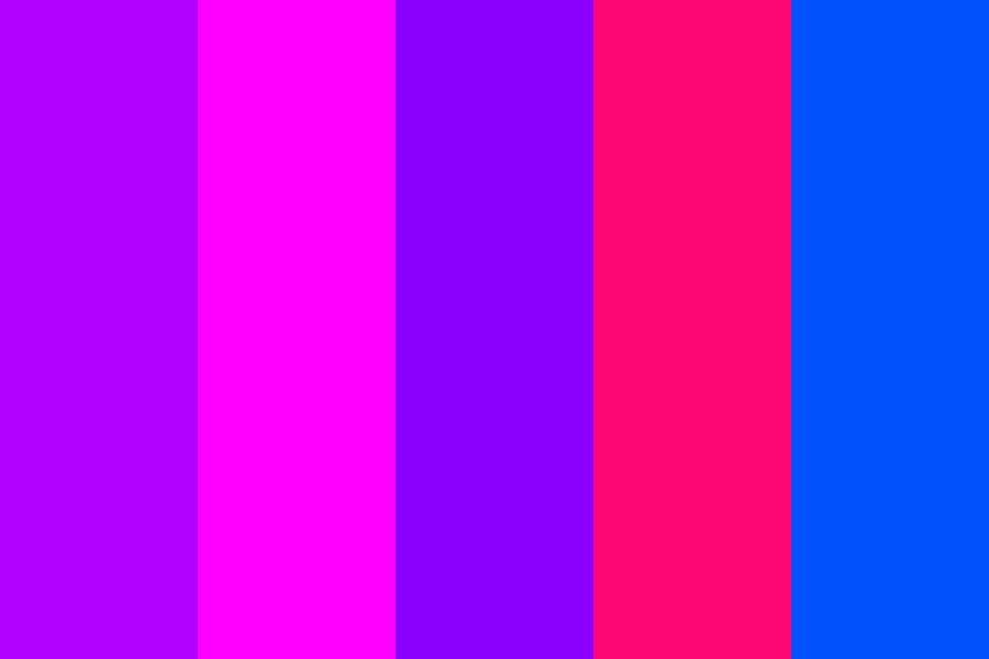
Hot pink, neon blue, various shades of purple with glowing effects should be your primary choices if you decide to craft the products in this genre.
Cyberpunk Color Palette in Graphic Design
Check out a few examples of cyberpunk graphic design for your inspiration.
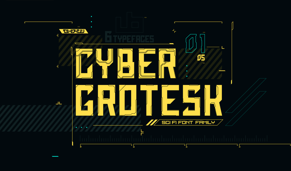
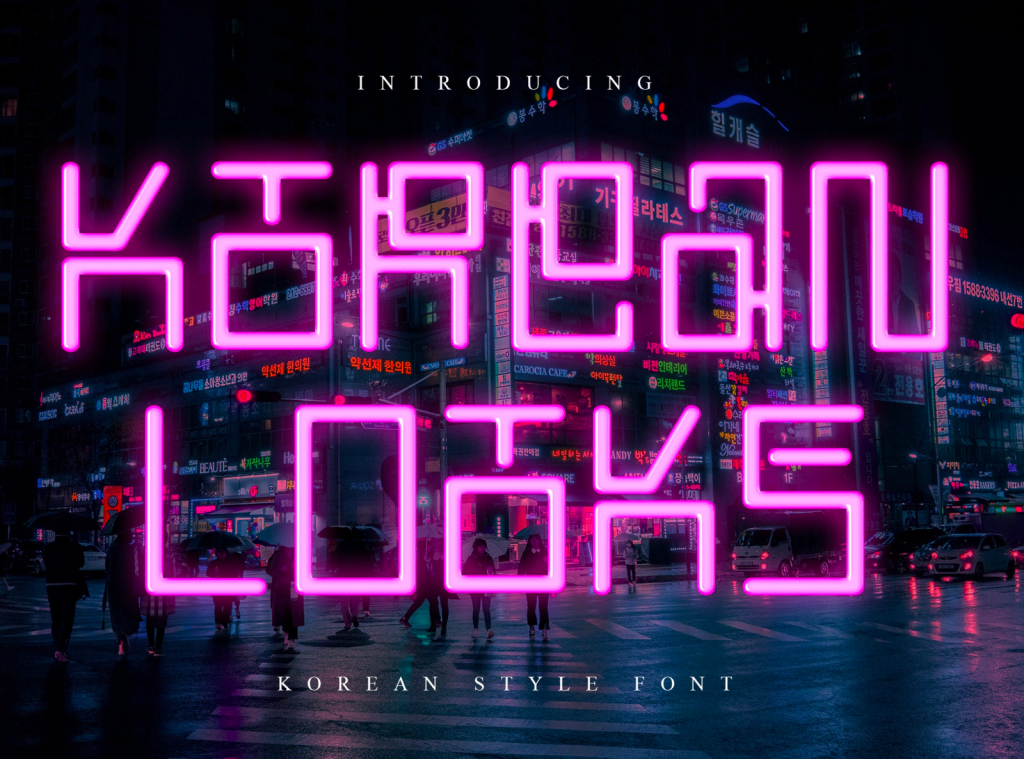
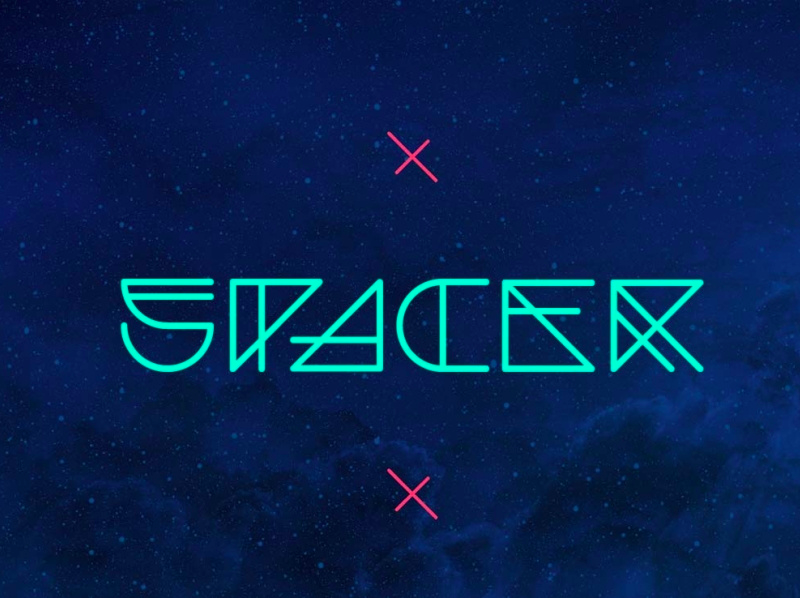
Cyberpunk fonts
These cyberpunk fonts will look great in your headlines and social networks. They are crafted for modern and unique designs that need real excellence and a special feel.
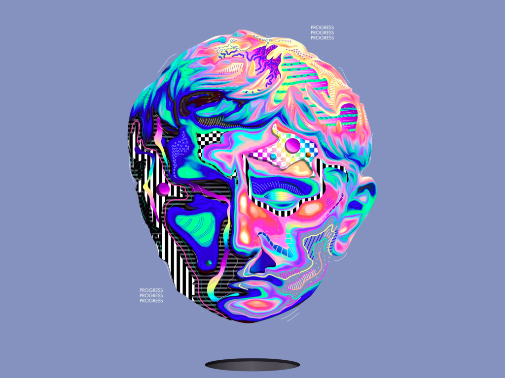
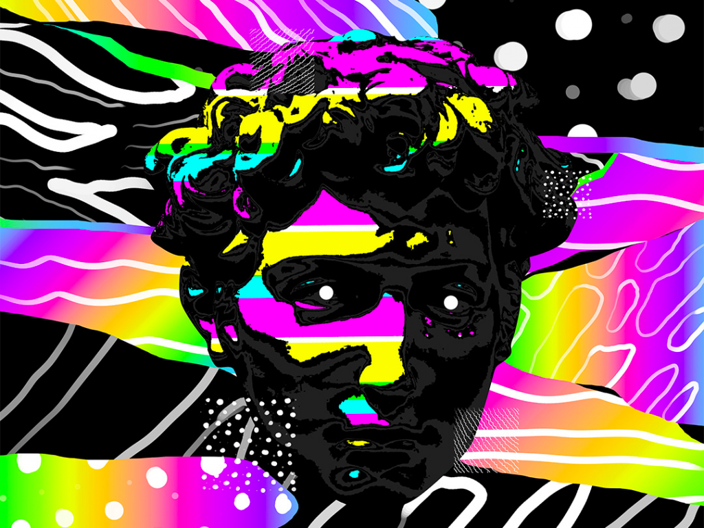
Cyberpunk Color Palette illustrations
Illustrations in the cyberpunk style depict non-existent worlds and spaces filled with neon lights, mysterious shadows, technology, and people.
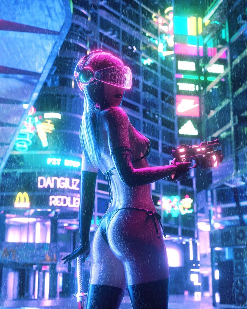
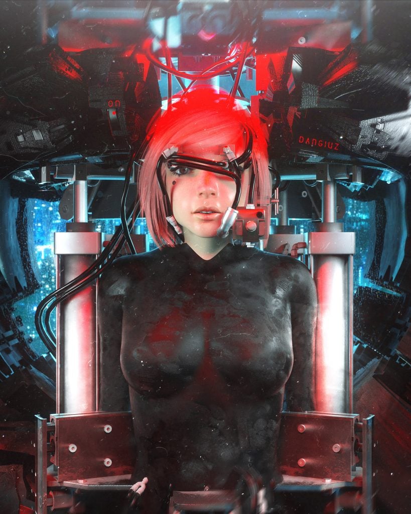
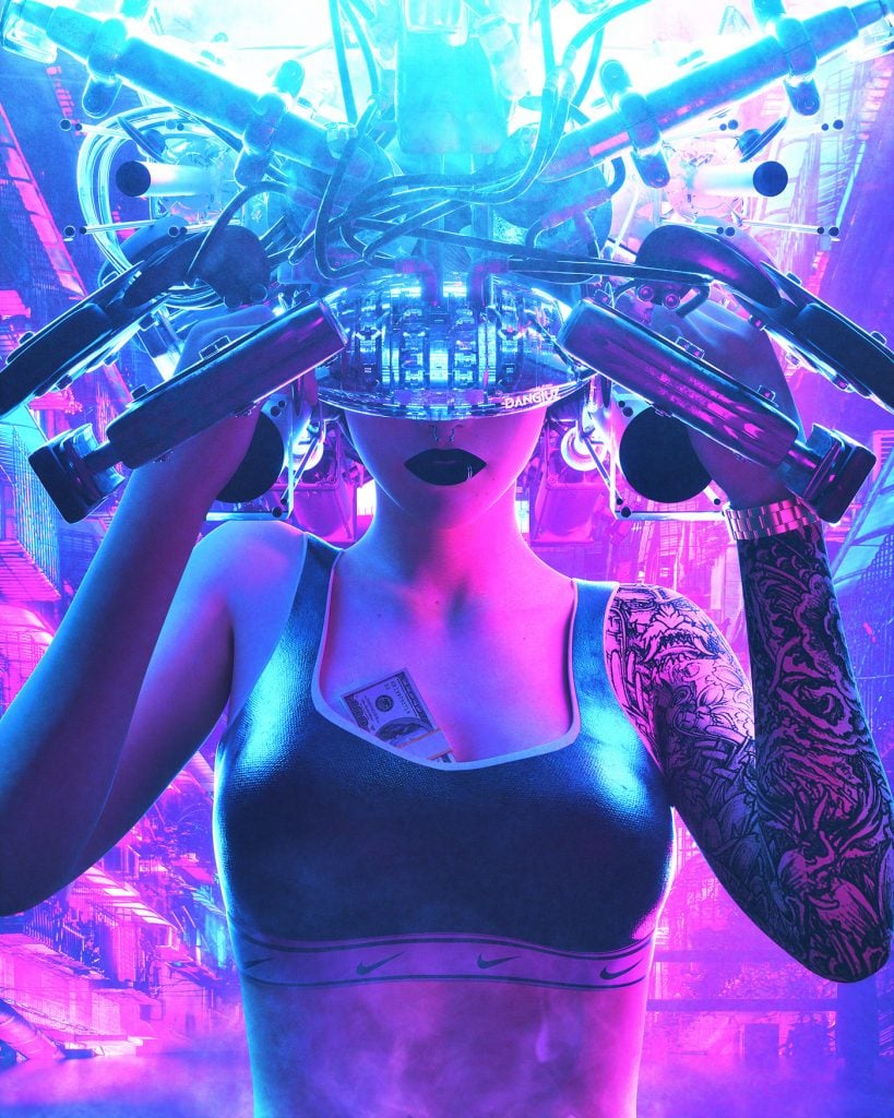
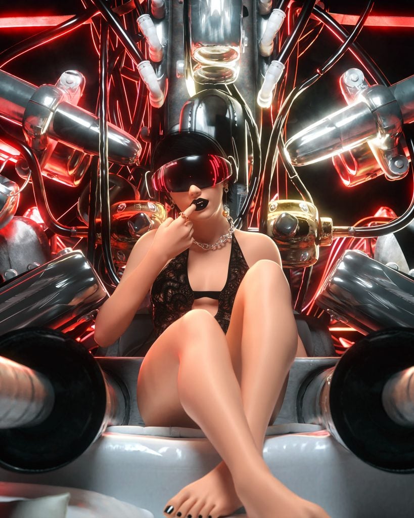

(Leopoldo D’Angelo)
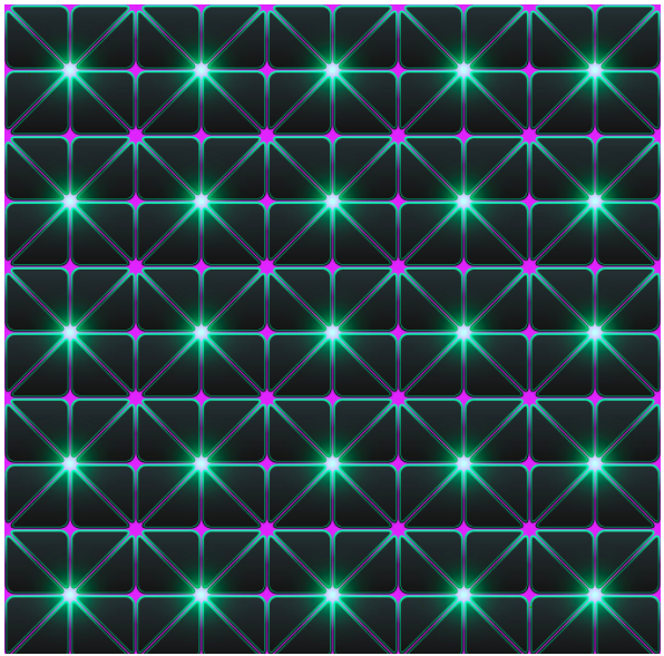
Cyberpunk Color Palette patterns
Cyberpunk patterns are a great solution for the background of a website or any other online project. Neon color nicely cooperates with all the other colors on the screen while making the design look really awesome.
Keep in mind the cyberpunk color schemes if you want to create trendy products and upload them to the TemplateMonster marketplace. Play with the cyberpunk colors to end up with truly inspiring graphics that are worthy of modern society.
Conclusion: Cyberpunk Color Palette
Cyberpunk is a world of fantastic movies, video games, and the distant future with incredible technologies, robots, affordable entertainment, and their vision of the world. Experiment with this graphic design style to bring new energy to the aesthetic that was established many years ago.


Leave a Reply