Paper Cut-Out Collages. Graphic design takes on new, more daring forms today. Designers strive to get out of the box and express their creative ideas more freely. And this is where paper cut-out collages come in handy. Along with street art styles, ultra-thin geometry, live data visualization, collage also takes place in graphic design trends of 2020 and directly characterizes this new decade. In this post, we will tell you more about this contemporary trend so that you can decide if you can take it for your work.

Collage Art: Back to Origins
The popularity of collages is not going anywhere — it is constantly evolving and widely recognized in contemporary design. But, what is the history of collage art and what did it start from? Let’s dive right in.
A collage defines the process of attaching different photos and paper onto a base sheet. But, its definition doesn’t end here. The collage has a whole lot of style and expressions from arts and crafts to graphic design and illustration.
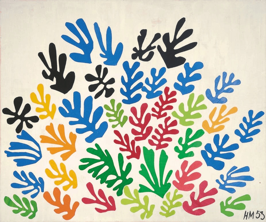
The art has become known in the early 20th century as a part of Cubism, the avant-garde art movement, and has greatly influenced the modern style. After the collage was first mentioned by Picasso and Braque, many artists used it in their artworks. E. g., Matisse created his well-known cutout series, while John Savage implemented collage art into his British punk aesthetic.
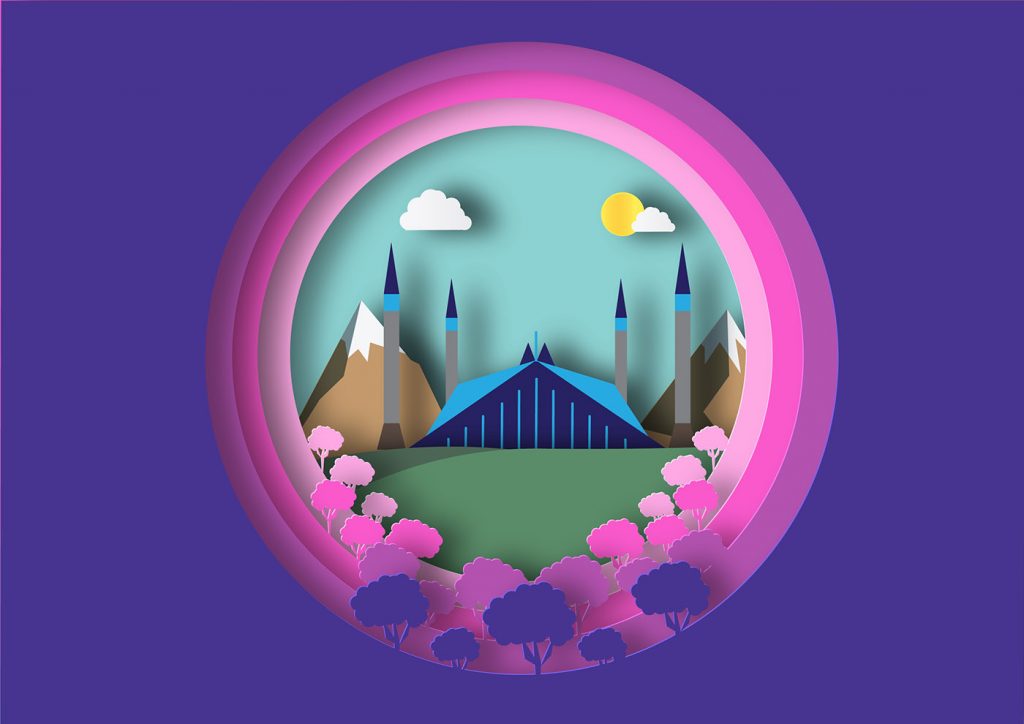
Till modern days, the collage remains an important and relevant form of art used for paper and digital collages.
- Paper collage, also known as the analog collage, is the original form of art. It involves handmade work, like paper tearing, and arranging it the way to build form. Although the designers are mostly limited by those materials they can find, these limits force them to come up with non-trivial ways to express their ideas.
- Digital collage is opposite to paper one. It doesn’t involve physical materials, nor the handcraft work. To create the digital collage, the artists turn to software like Photoshop which allows changing the texture, overlaying multiple layers of photos and illustrations, as well as distorting the raw material.

No matter what type of collage art the designer chooses, any requires creativity. The artists are free to combine drawing, brush strokes, and different textures to come up with a new distinctive design.
Collage Art: Use Cases
So, we’ve found out that collage art is way popular among artists and designers. Now, let’s consider a few places it is most often used.
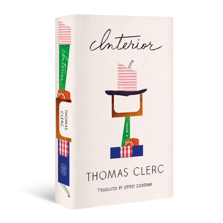
- Book covers. Collage is a great solution for book cover design as it provides numerous ways to illustrate the content of the book and sometimes even reflects its theme. The paper collage makes the books stand out which is for the benefit of the writers.
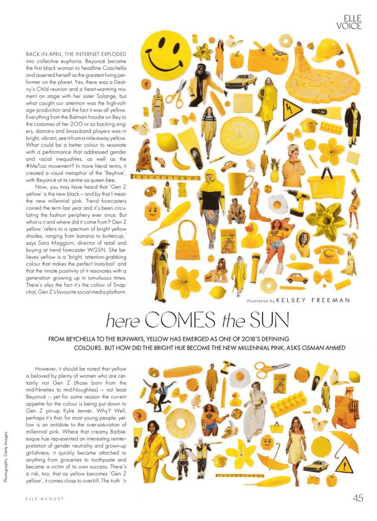
- Editorial illustrations. The collage builds up layered elements that look like they are going to jump off the page, which creates a sense of movement. This is the reason why collage illustrations are used for fashion magazines, newspapers, and blog posts. They usually contain color blocking and colorful paper cutouts which make readers stop and dive into the article or blog post.
- Brand design. Using collage design allows brands to convey the idea that their products are different and have nothing in common with their competitors. In most cases, they turn to paper-cut characters, vintage imagery, paper texture, and layers upon layers of different colors to build an outstanding brand identity.

- Music artwork. In addition to book covers, editorial illustrations, and brand design, collage art shows itself well in album artworks. With contrasting elements of the photography used for albums, it visually represents the music, adds a special atmosphere, and attracts the audience.
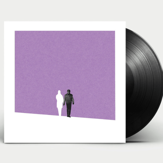
Graphic Design Trends 2020: Paper Cut-Out Collages
Designers always try to create a project that would attract as many viewers as possible. This is where arts and crafts can be underestimated because it is sometimes taken not seriously. Although, paper cut-out collage is a great way to come up with new sceneries and non-trivial relationships between the elements from different universes, such as illustrations and photographs.
The designers reject seamless photo manipulation, leaving images with angular edges and white outlines. This approach allows bridging the gap between contrast and harmony, as well as creating the asynchronous beauty from the disparate elements combined.
| Tip for TM authors: if you want to deliver an outstanding product that will be popular among our clients, come up with a design based on paper collage. You can use it for backgrounds, textures, clipart, and other design elements. |
Impressive Paper Cut-Out Collage Projects
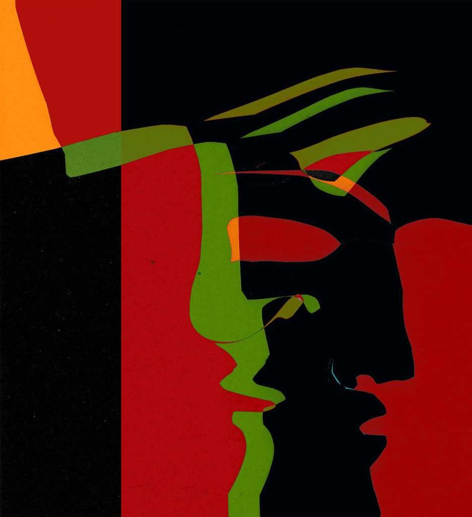
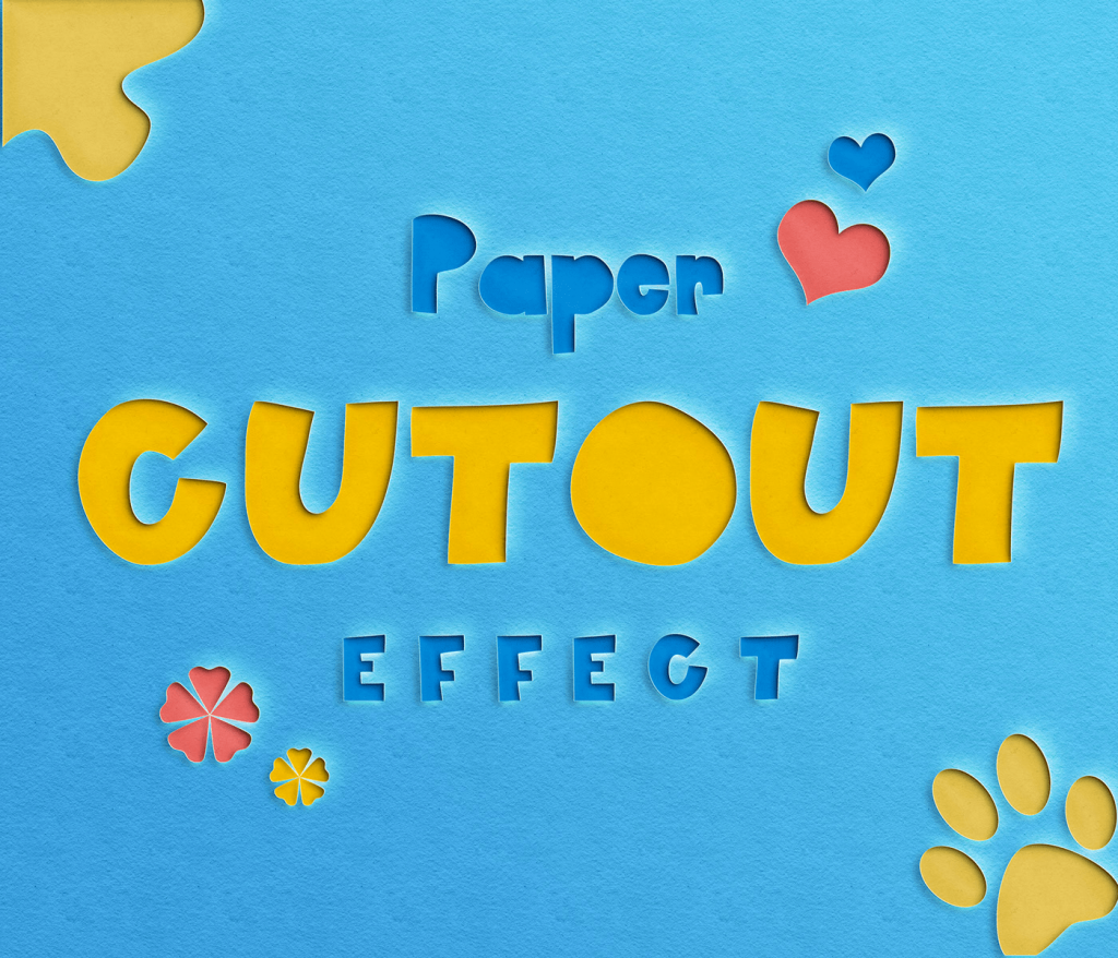
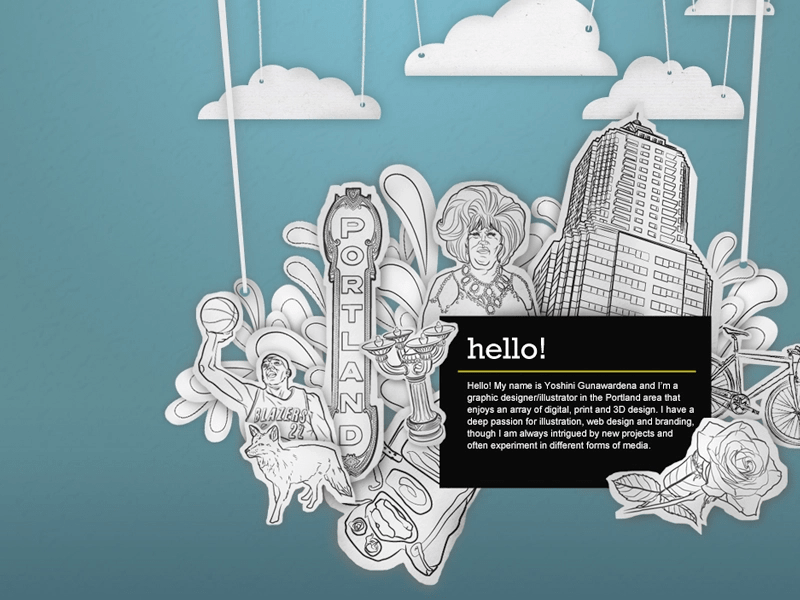
For your inspiration, we’ve brought together a few bright examples of paper cut-out projects. They will make a terrific addition to designer layouts, posters, and other creative works. So, take a closer look at them to learn something for your own design.
Jan Rollof
Paper Cut-Our Text Effect by Ma Ni
Hello from Portland! by Yoshini G White
Paper Cut-Out Collages

Paper Cut Out Shots



Leave a Reply